I have always been fascinated by interior design. I think there is something magical about taking an empty space and transforming it into a beautiful and functional room. Despite my fascination with it, I was never really able to transform my home the way the professionals on HGTV did. Rather than the crisp, sophisticated, mature look I wanted, my houses tended to look more like college dorms.
One upside of moving so often is that every couple of years I have the chance to try again and get it right. This last move to Ohio was when I decided to get serious. Rather than just pick out little elements I liked from each room on Pinterest, I paid close attention to overarching themes. I noticed what the rooms had in common, and what techniques the designers used each time, and I became very aware that I was decorating in ways that the professionals avoided.
Now that my Ohio home is set up and looks just like I want, I figured I’d share some of the design mistakes I made over the years that I avoided this time around. I’ve also added some contrasting images — no-no’s on the left, and better alternatives on the right. But hopefully you could tell the difference without me explaining that. 🙂
Let’s begin!
“As mentally stable as an IKEA table.”
You have probably been advised at one point or another to skip buying cheap furniture and save up for high-quality heirloom pieces. And if you’re anything like me, you probably ignored that advice and let instant gratification take over. Well, I’m here to say that the advice is right, and instant gratification is wrong. I owe my mother-in-law, Lynn, an apology for ignoring her advice on that. Cheap furniture looks and feels cheap, and because of how quickly it gives out, you’ll spend much more money over time. Feel free to hit up IKEA and Walmart for lamps and poufs and whatnot, but when it comes to picking your sofa, table, chairs, or bed, hold out for higher quality. Not only will it last you longer, but it will look much better than the flimsy alternatives. Also, even though glass top tables seem like an affordable and pretty option, they are incredibly hard to keep clean (yes Lynn, you were right again!). Every little fingerprint and smudge of dust shows. Avoid clear tops unless you want your home to look perpetually filthy. Plus clear tops are most commonly used for outside, and bringing them inside will give the vibe that you are using patio furniture.

“Measure twice, purchase once.”
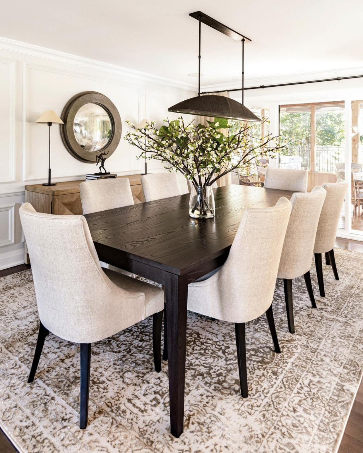
I have learned this lesson the hard way more times than I care to admit. But seriously, before you buy anything: measure, measure, measure! And I don’t mean eyeing the space and guesstimating whether something will fit. You need to go all out. Measure your space, and get the exact dimensions of the furniture you want to buy. Tape out outlines in your space to get a feel for it. Grab some graph paper and shade in where everything will go. Don’t forget to account for plenty of space around windows, doors, staircases, and walking paths. And for heaven’s sake, ensure the items can get through your front door! Then on the other hand, make sure you’re not getting pieces that are too small. Generally speaking, the length of your coffee table should be approximately two-thirds the length of your sofa. If you have a sectional, there should be no more than 18″ of space around your coffee table (16″ is the ideal). Putting a tiny little coffee table with a large sofa or sectional not only throws off the look of your room, but it’s not practical for everyone to use.
“Just because it CAN fit doesn’t mean it SHOULD fit.”
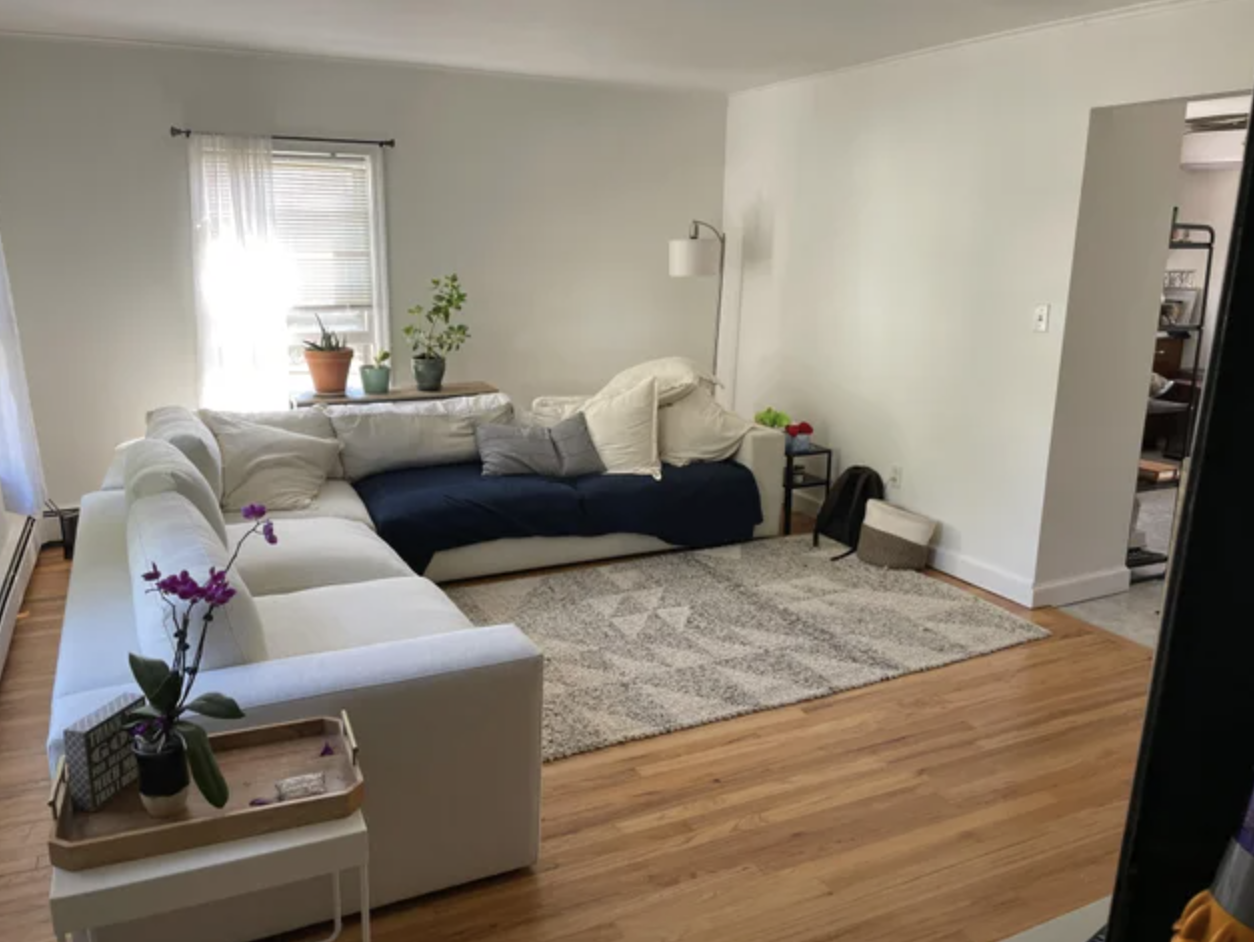
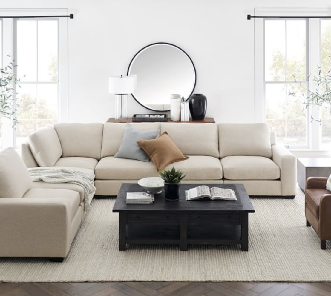
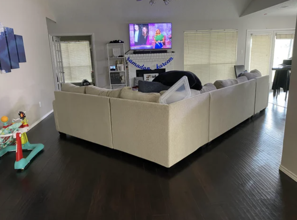
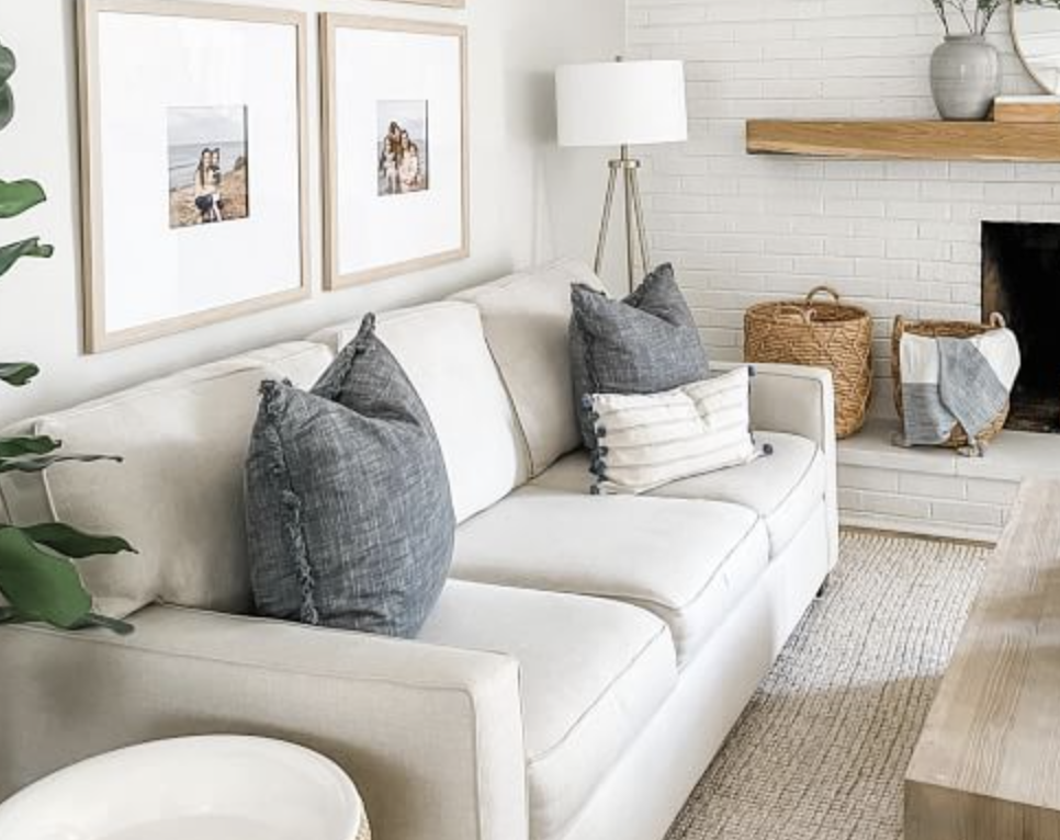
Okay, so you’ve measured and determined that the furniture you want can fit through your door and into the room. Great. But does it actually work for your space, or are you trying to force it? A large dining table might technically fit in a small breakfast nook, but are chairs (and the people in said chairs) going to get trapped against a wall? You might love the idea of a massive sectional, but it will likely become an obstacle course in a connecting space. Focus on what will look AND function well in your space, not just what looks good in a different room on Pinterest. Be especially careful when setting up living room seating areas. The most common option is to situate furniture against walls, and open to the entire room. It’s pretty hard to mess that up. If you opt to pull the seating areas in, make sure your room is large enough to accomodate your furniture in that way. You should have at least 4-5′ of unobstructed walking space all around your seating area. Avoid really long furniture pieces in this case so you don’t “wall off” the room. Our house is open concept, and to create some division I set up my living room furniture in an L shape, using the window wall as a focal. There’s about 5′ of walking space on the path from the foyer, through the room, then into the kitchen and dining room. There’s 7ish feet of space between the back of sofa and the dining room, and 4′ of space between the edge of the sofa and the window. Yes, I did use a photo of my home as the “good” example on the right.

“There’s a line between cozy and cluttered.”
It’s always nice to have blankets and pillows to make things cozy and warm, and to have our favorite boardgames handy, but it’s easy to get out of control and cross the line into cluttered. Don’t be afraid of empty space! There’s nothing wrong with having a blank wall, an empty corner, or a clear surface. Don’t feel like you have to run right out for fake plants or extra shelving just because there’s a corner in your home that isn’t filled. Remember that the more stuff you stick in a space, the smaller (and messier) it will look. And if you have filled every available corner and surface, you simply have too much stuff. Take a critical look at everything you have out. You might need to get rid of an accent chair or bookshelf. Or you might need to purge some of your small decor pieces. I’m all about adding realistic looking artificial greenery, but do you really need a floor vase filled with tall fake flowers, or decorative vines draped over your cabinets? Do you need faux succulents on every windowsill? In the legendary words of Coco Chanel: “When putting on accessories, take off the last thing you’ve put on.” This applies to homes too. Don’t overfill, and don’t over-accessorize.


“Your TV hurts my eyes. And neck.”
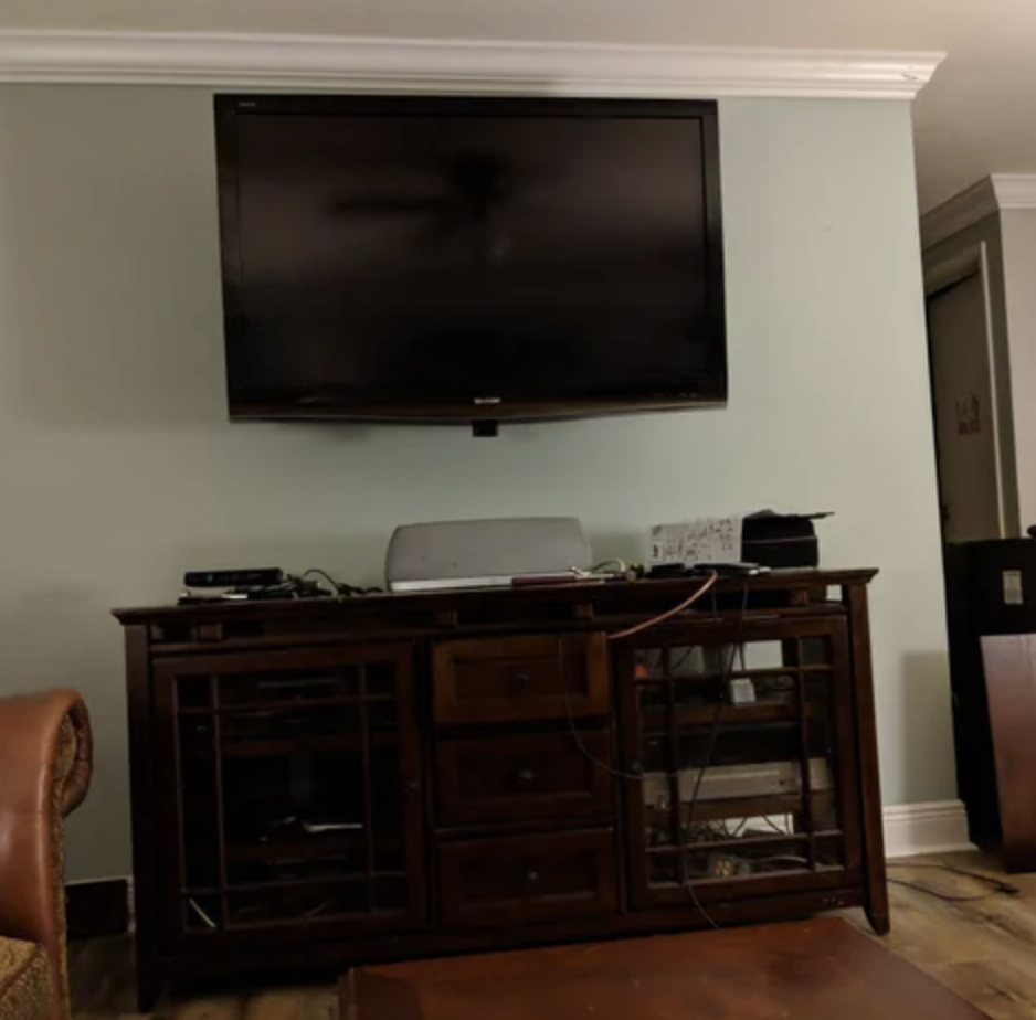
You know how when you go to a movie theater, and you try to get there early to get a seat the perfect distance from the screen? Unfortunately, as picky as people are at movie theaters, they aren’t nearly as discerning in their homes. Most people position their TV way too close to where they are sitting, or mount it way too high. This means your eyes are straining, the picture is distorted, and you have to slink down in your seat or crank your head back to see. When setting up your TV, the bigger the screen, the further back your seating should be. For screens under 40’, you can sit pretty close — about 5-6’ away. For big screens in the 70-80” range, you’ll want to be 12-15’ away. For screen sizes anywhere in the middle, plan for at least 9’. Then keep in mind the center of the screen should be only 30” higher than the lowest seat in the room, or about 42″ from the floor to center of the TV. The only exception is if your furniture can be moved far enough back that you don’t have to look up. Think twice before mounting over a fireplace in a narrow space!

“Don’t take the lazy way out when hanging.”
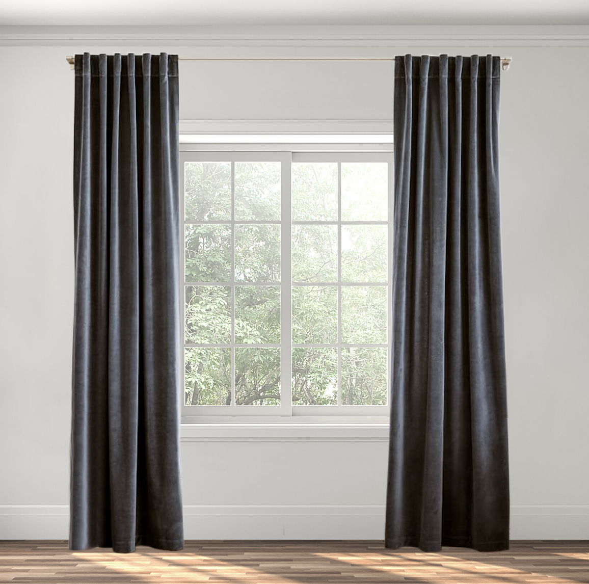
Somewhat related to TV positioning, but where you hang curtains and artwork matters. If done right, your space can look larger and brighter than ever. If done wrong, you could make your space look small and dingy. There is a very simple strategy for each. With curtains, hang the rod close to the ceiling — a minimum of 2/3 the distance between the top ledge of the window and the ceiling. Get curtains long enough to touch (but not sag) on the floor. Extend the curtain rod out 10-12” beyond the edge of your window, so that when you open the curtains, it doesn’t block any light at all. This will all give the illusion of taller ceilings and larger windows. For artwork, you should measure 57” from the center of your photograph to the floor. If you have a super tall family member, you can get away with a little bit higher — the center can go up to 60” from the floor. This will make your space look polished and crisp.

“Velvet and satin and fur, oh my!”
Look — furniture and material accents should not be shiny or furry (unless we are talking subtle seasonal accents, like a velvet throw pillow for Christmas or fur trimmed stockings). I know it’s fun to run your hands over all the faux fur and synthetic velvets in the Marshall’s pillow section, but nothing, and I do mean nothing, cheapens a space faster or more thoroughly than materials like velvet, satin, and faux fur. For a clean, sophisticated space, stick with natural fibers (or natural-looking fibers). For accent pieces think linen, jute, and cotton. For big pieces that get heavy use, consider performance fabrics like basketweave slub polyester or a chenille blend. It gives the look of natural fiber but still allows for durability and easy upkeep. From there you can still have a variety of soft and unique textures, and your space will look classy rather than trashy. If you would have gravitated towards a particular fabric in your teen years, it’s safe to say you should flee from it as an adult. Say goodbye to the velvet armchair. Back away from the sequined pillow. Relocate the furry blankets to a closet or storage basket until it’s time to bundle up.


“Stop trying to make gallery walls happen.”
Gallery walls were trendy for about a minute — but they lost steam quickly for one simple reason: they always look cluttered. And cluttered spaces are for teenagers, not adults. Now, don’t get me wrong, I know it’s tempting to want to throw everything up on the wall. We have all traveled to cool places and experienced amazing things, so of course we want to display those memories proudly in our homes. However, displaying *all* of those memories on a single wall doesn’t showcase those memories in their best light. Rather than hanging a decades worth of travel souvenirs up in the same spot, try a large pushpin map and mark off everywhere you have visited. If you have a ton of amazing wedding photos, try spreading them out across the house rather than squeezing them all into the same room. Instead of clipping dozens of tiny scenery pictures to strings, choose one meaningful picture to blow up and frame, and turn the rest into a coffee table book that you can flip through while you drink your morning coffee. Your personality and stories will still shine through in your home, but your space will look much cleaner.


“Back away from the neon sofa.“
There is no nice way to say this. Colored furniture can be very trashy and usually only looks good in carefully staged catalog photos. More often than not, once you take that colorful sofa off the glossy page and stick it in your space, it loses all its luster and looks more like a pre-teens bad decision. And before anybody gets all up in arms, I am *not* referring to dark, muted, pale, or natural colors like navy blue, pale sage green, or saddle tan. I’m talking about teal. And pink. And red. And the list goes on. And you might think you are the exception to the rule — but let’s be honest, you’re probably not. And that’s okay! There is nothing wrong with getting staple pieces in neutral tones, then bringing in color through accents. Then, when you inevitably get tired of royal blue or emerald green or baby pink, all you have to do is replace throw pillows and curtains, rather than a $3,000+ sofa. So you’re saving money, AND your home looks like an adult lives there. Win/win! (I’ll add though, there ARE exceptions to this rule: 1. A petite staple piece in a natural-looking material has a better chance of looking good in color than a large, bulky item in an obviously synthetic material. Think a compact sofa in cotton twill rather than a massive shiny velvet sectional. 2. Really grand spaces with soaring ceilings, unique architecture like coffered ceilings, and floor to ceiling windows can work with colored furniture because the furniture isn’t the primary focal point, and the high end finishes elevate everything around them. 3. Professionally designed maximalist spaces pretty much beg for colored furniture. But maximalism can go wrong very, very easily, which is why I say professionally designed. Throwing a ton of neon colors into a bright wallpapered room does an appealing maximalist space make.)


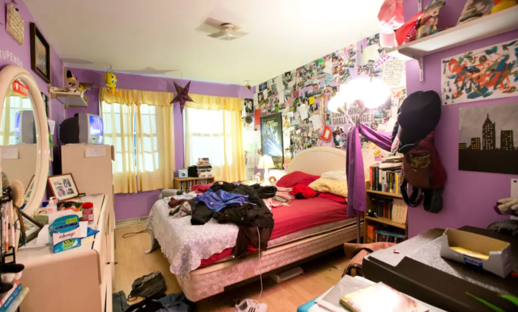
“Is that the same bed from your college dorm?”
Ahhh…the bedroom. There is so much to say about creating a sophisticated, relaxing bedroom, and putting together a really nice bed. I think the first thing to get out of the way is that your mattress should be up on a frame and box spring, not just dumped on the floor. You should also really have a headboard (ideally upholstered, especially if you’re like me and enjoy reading in bed), and some kind of fitted bed skirt if you don’t have a platform bed. That way you can’t see metal legs or the box spring. Once your bed is off the ground and there’s a headboard in place, it’s time to think about bedding. Bright colors, bold patterns, and vivid textures are really hard to execute well. They usually look overly feminine or extremely juvenile. But on the other hand, stark black and white is harsh and unwelcoming, and textureless bedding looks institutional. So, what’s the solution? Neutrals in subtle textures, and plenty of layers and comfy elements, of course. Avoid stark white bedding, especially if you have black or dark gray furniture. Go for light beige, off-white, cream, sand, warm greige, and other “white adjacent” colors. And don’t just stick with one shade, choose 3 or 4 and use them all. Limit patterns to one or two complimentary accent pillows, rather than spreading the pattern all over your bed. Avoid really noticeable repeating textures like pinch pleats, tufted chevrons and stripes, medallion stitching, etc. Stick with tonal stitched quilts, naturally textured linen duvet covers, and subtle woven blankets. Make sure your duvet is filled and fluffy and puffy, not all thin and flat like the comforters from Target’s “bed in a bag.” IYKYK. And make sure you layer! There are tons of articles out there on how to make a bed like a professional designer, and all of them call for layers. If you just have a bedspread topped with matching shams, you are wrong!


“Pillows should not be doubled as cushions.”
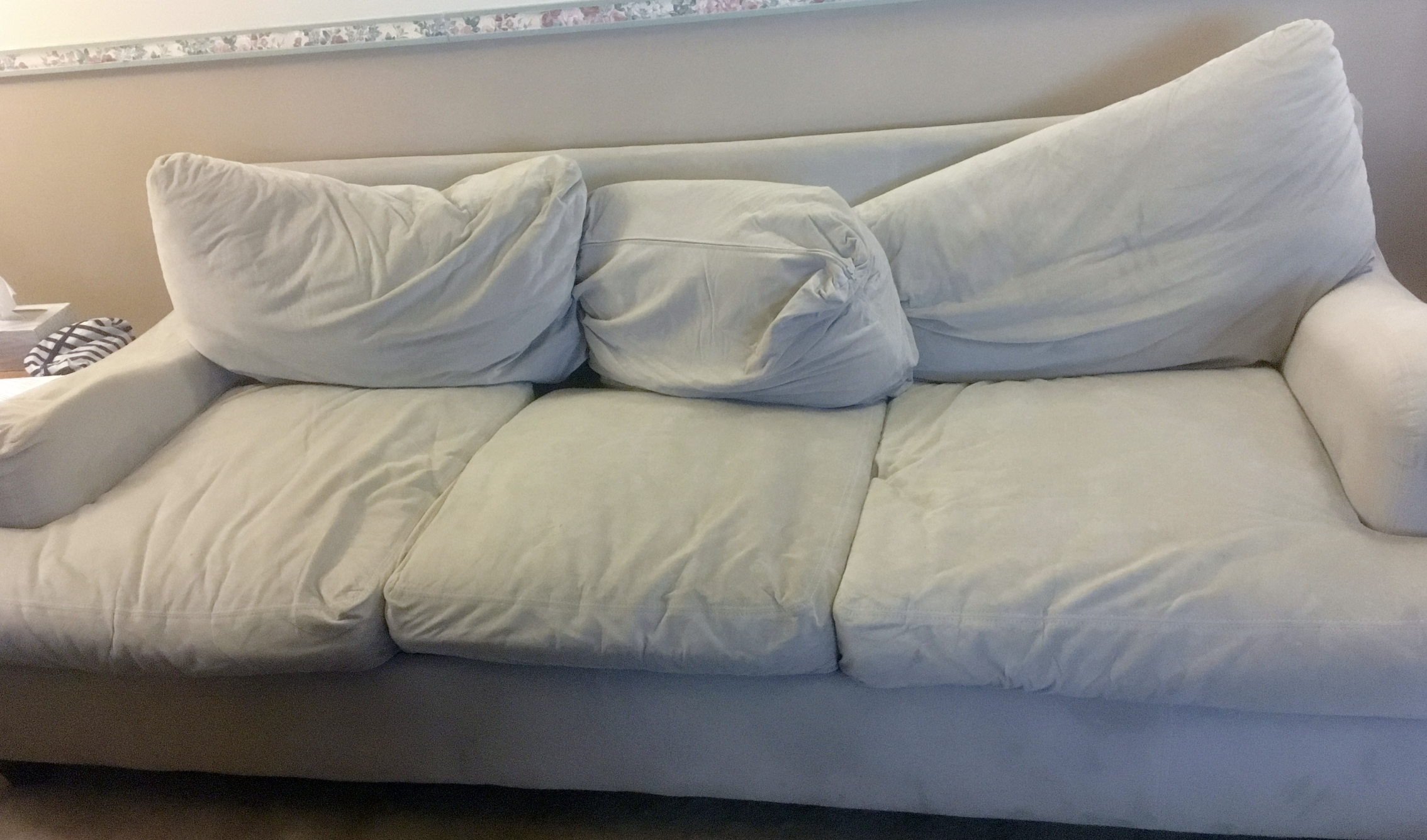
I know down-filled cushions were all the rage a while ago — after all, if you don’t think too hard about it, it seems like a comfortable solution. But then when you think for a few seconds, you’ll think about what happens to your down-filled pillows after you use them for a bit. That’s right. They get all squashed down, misshapen, and saggy looking. And that’s exactly what happens to down couch cushions. After just a few weeks of use, your brand-new down-filled sofa will look like it’s on life support. Down stuffing doesn’t recover its shape easily, so it’ll take a lot of time and effort to keep your sofa looking even halfway decent. Save yourself the hassle and just get a couch with soft foam cushions. Foam and other “shape holding” cushion fillers come in all different density levels, so you can get a downy-soft cushion that bounces right back after your accidental nap in front of the tv. Focusing on durable filling means you’ll still be comfy, and your sofa will look nice and new for a long time.
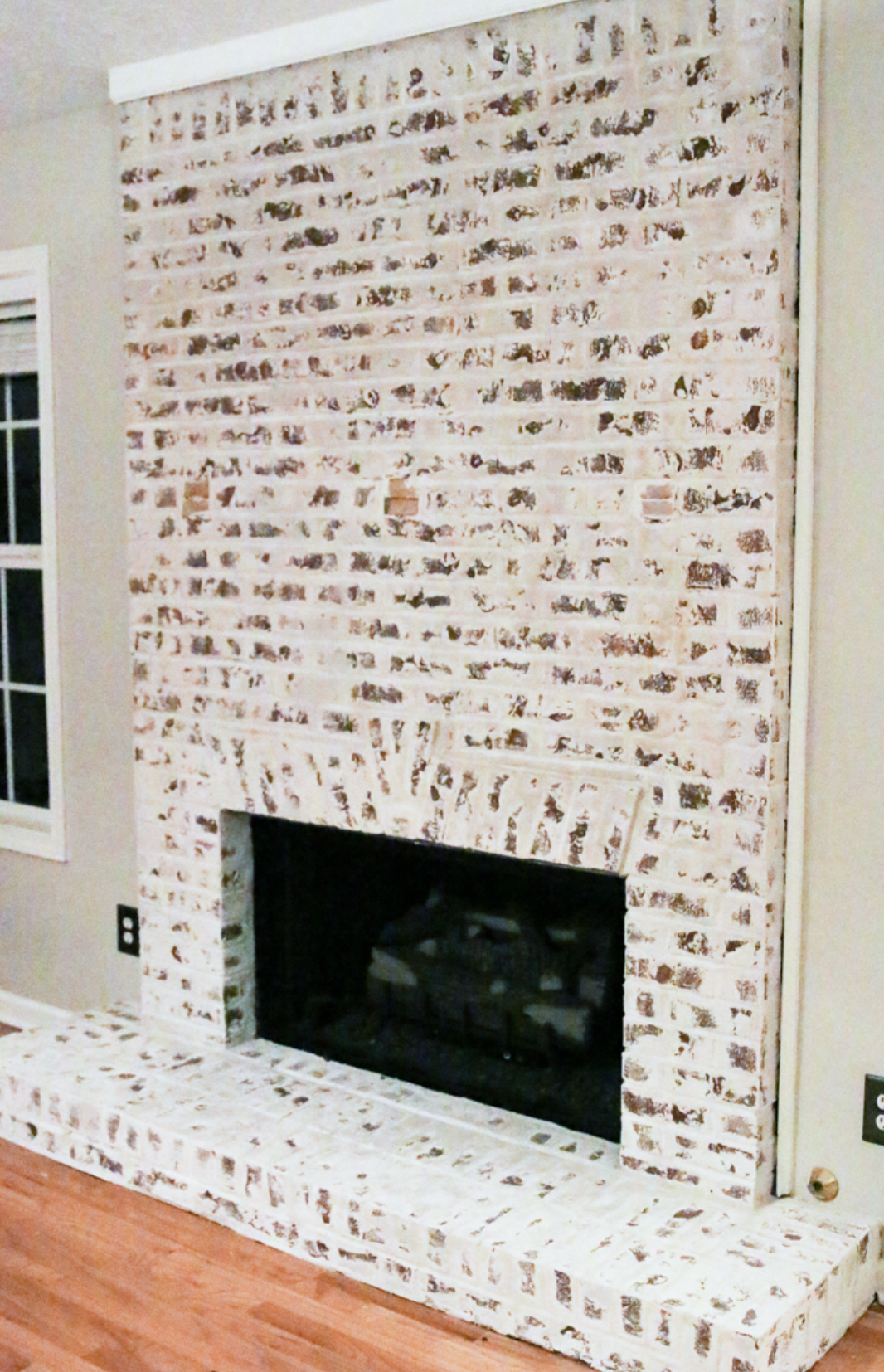
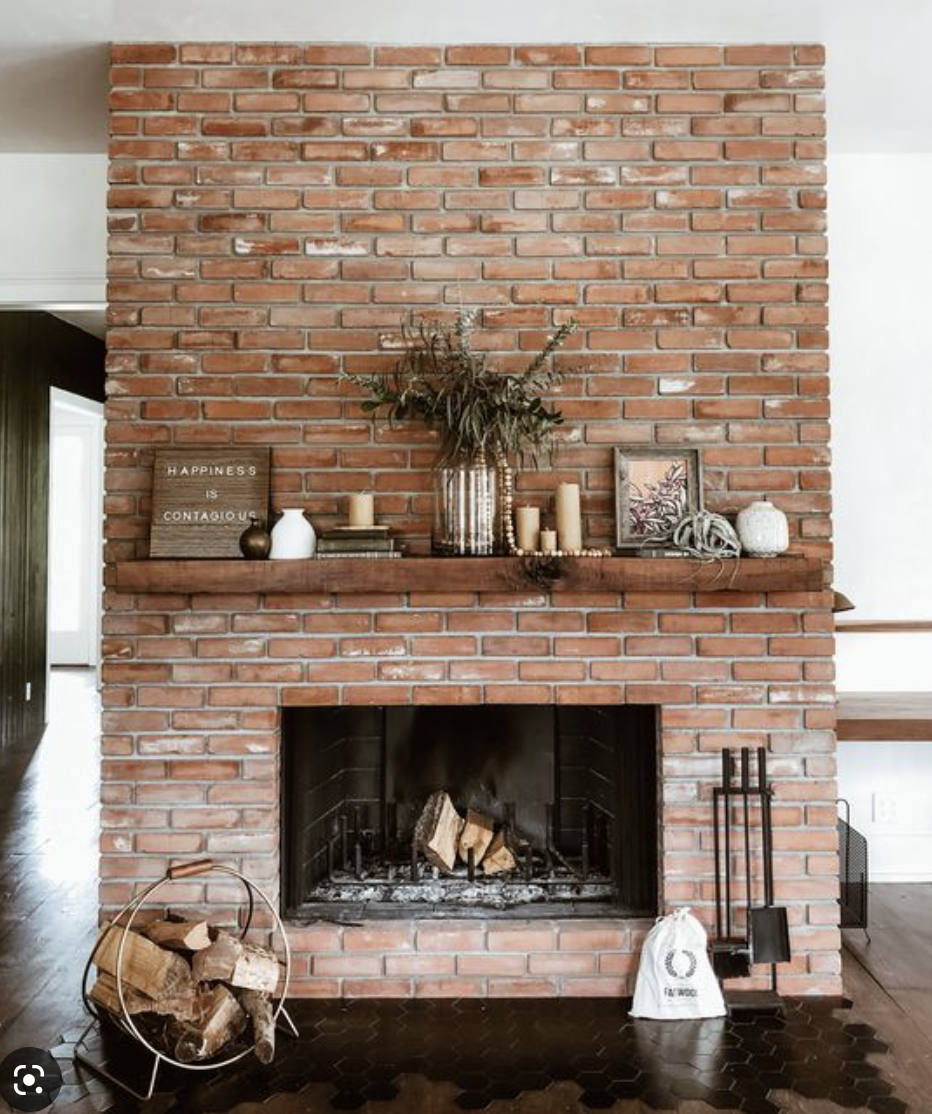
“That fireplace is not your crash test dummy.”
This cannot be overstressed — stop doing DIY projects on unique features in your home! It is horrifying how many people alter beautiful and historical elements because they saw somebody else do it on Instagram. Find a way to incorporate those special things, rather than fundamentally changing them or getting rid of them entirely. If there’s a stained glass window in your half bath, please do NOT replace it! If you have a brick or stone fireplace, put down the paint and back away. Checkerboard tile in the bathroom? That’s amazing! These unique elements are not bad things — they set your home apart from all the rest. And I understand there might be some things that just don’t work with your style, that drives you nuts every time you look at them. So if you absolutely cannot live with something in your home, do yourself a favor and hire a professional to execute the updates correctly. DIY projects requiring minimal time and effort LOOK like minimal time and effort went into them. That’s something you expect to see in a broke college students’ first apartment, and not in an established adults’ home. Not to mention, those DIY projects based on current trends will become outdated in a year or two (if not sooner), and then you will be right back to square one.
I say all this because I have made literally every single one of these design mistakes. I’ve failed to measure and filled my home with cheap IKEA and Walmart furniture that was too large to be functional. I’ve hung my TV and pictures too high, and my curtains far too low. I’ve filled every empty space with shelves, and then filled the shelves with more unnecessary decor. To this day I still fight the temptation to load up every surface with books and candles and fake plants. My first bedding set for the master bedroom was faux fur (!!) and I’m guilty of trying to throw all of my travel souvenirs and skydiving pictures up on a gallery wall. I have a lot of stark white bedding and “bed in a bag” type comforter sets I am still trying to get rid of (they are closet queens for now). I’ve purchased furniture in gaudy colors that I quickly grew tired of, and down filled cushions that quickly grew tired of me. And most egregious of all, I painted over a beautiful stained glass window in our house in New Mexico. I know, I know. I’m the worst.
It took me eight years and six homes to figure out some of the big things I’d been doing wrong. I like to think I finally got it right this time around, but I’m sure I’ll learn more over the next eight years and however many homes. I hope that by reading through this, you’ll be able to learn from my mistakes and end up with a beautifully designed home that feels welcoming and beautiful to you.
